Choosing the right color for a boy’s bedroom sounds simple at first. Then you stand in front of a wall of paint samples, stare at twenty versions of blue, and suddenly question every decision you have ever made. I’ve been there, and honestly, bedroom color can change the whole mood of a space faster than almost anything else.
A boy’s bedroom needs to do a lot. It needs to feel fun enough for playtime, calm enough for sleep, and practical enough to handle books, toys, clothes, school stuff, and all the random little things that somehow end up everywhere. That is exactly why color matters so much. The right palette makes the room feel bigger, cleaner, warmer, cooler, or more put together without a full makeover.
I always think the best bedroom colors strike a balance between personality and function. You want a room that feels like him, not a generic space with one bright wall and a few pillows trying their best. You also want something that can last a while, because repainting every year gets old fast.
So if you want a room that looks fun, feels comfortable, and actually works in real life, these ideas will help a lot. Some of these color schemes feel bold and energetic. Some feel calm and cozy. Some do both, which is honestly the dream. Let’s get into the best boy bedroom color ideas that feel fun and functional.
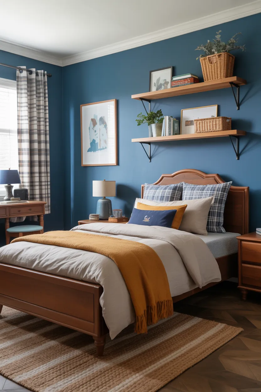
1. Navy Blue and Crisp White
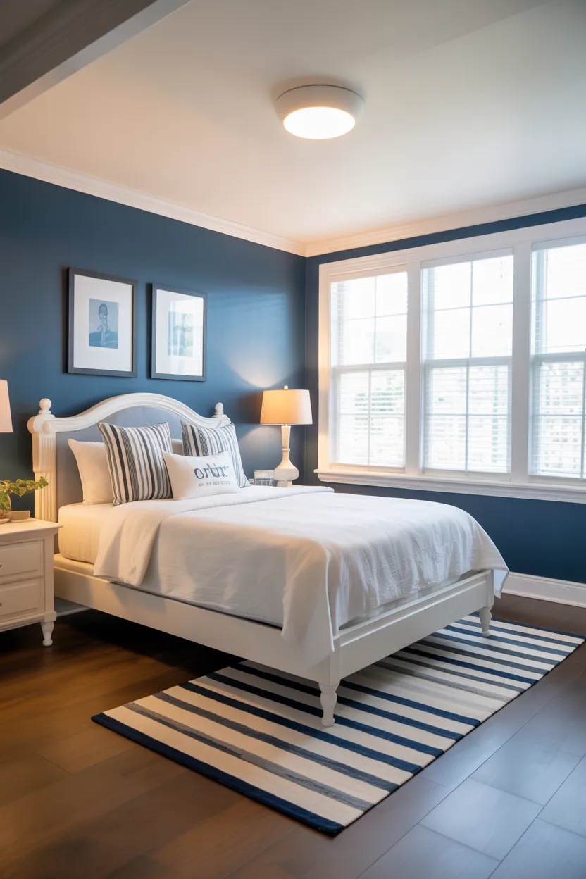
Navy blue and crisp white will always be one of my favorite combinations for a boy’s bedroom. It feels classic, clean, and strong without trying too hard. This pairing has that easy, timeless look that works for a little boy, a tween, or even a teenager.
Navy brings depth to the room, which helps the space feel grounded. White keeps everything bright and open, so the room does not feel heavy. That balance matters a lot, especially if the bedroom is not very large. A full dark room can feel a little too serious, but white softens navy in the best way.
I like this combo because it works with so many styles. You can make it feel sporty, coastal, modern, simple, or slightly preppy depending on the furniture and decor. That kind of flexibility makes life much easier when you want the room to grow with your child instead of needing a complete redesign every other year.
Try painting one wall navy and keeping the other walls white. That setup gives you contrast and personality without making the room feel closed in. You can also bring navy in through bedding, curtains, rugs, or storage bins if you want a lower commitment option.
A few details that work especially well with this color scheme include:
- White or light wood furniture
- Striped bedding
- Metal bed frames
- Simple framed wall art
- Red or gray accent pieces
This palette looks polished, but it still feels playful. That is a pretty great combination for a bedroom.
Also Read: 23 Kid Friendly Bedroom Color Ideas for Restful Nights
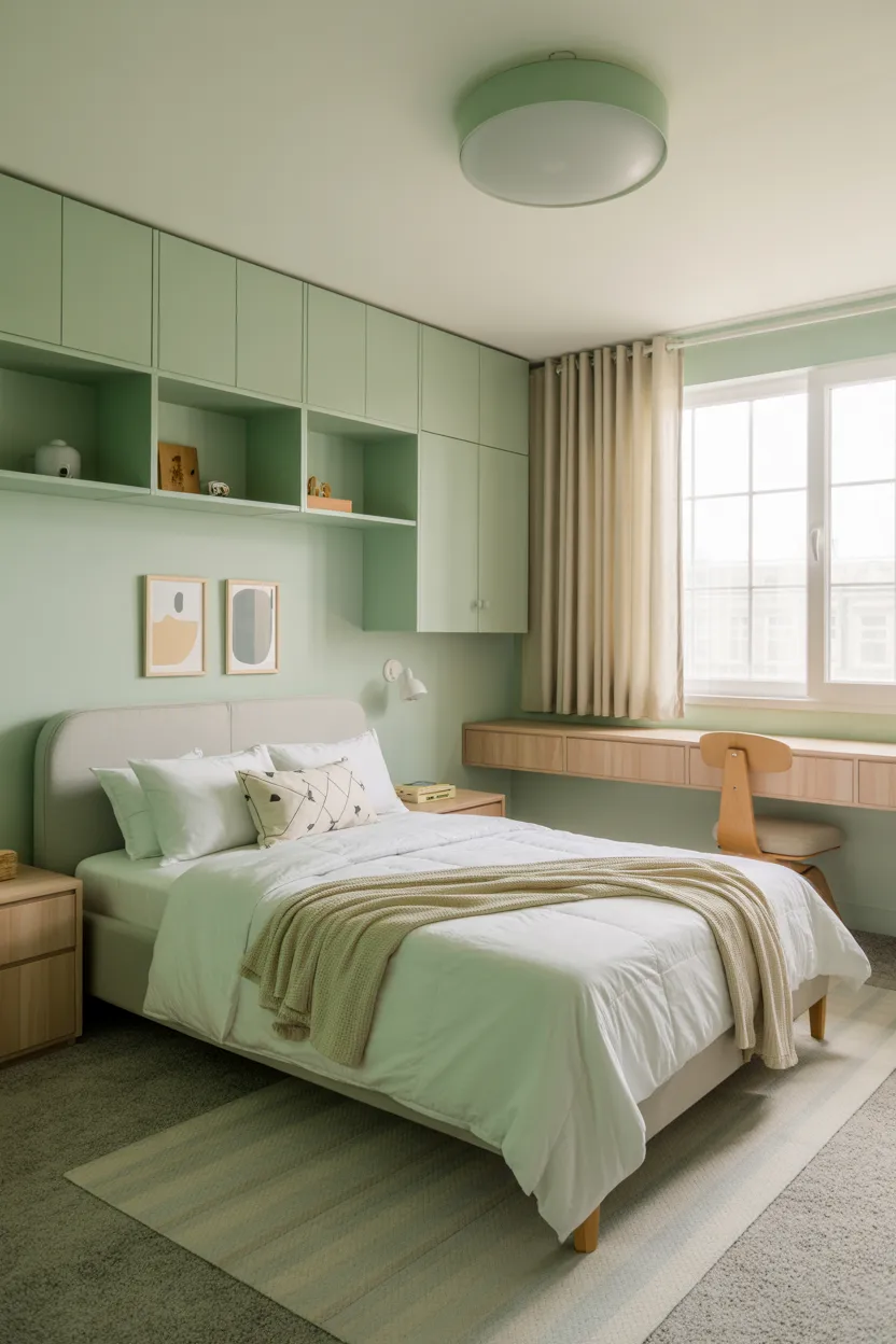
2. Sage Green and Warm Beige
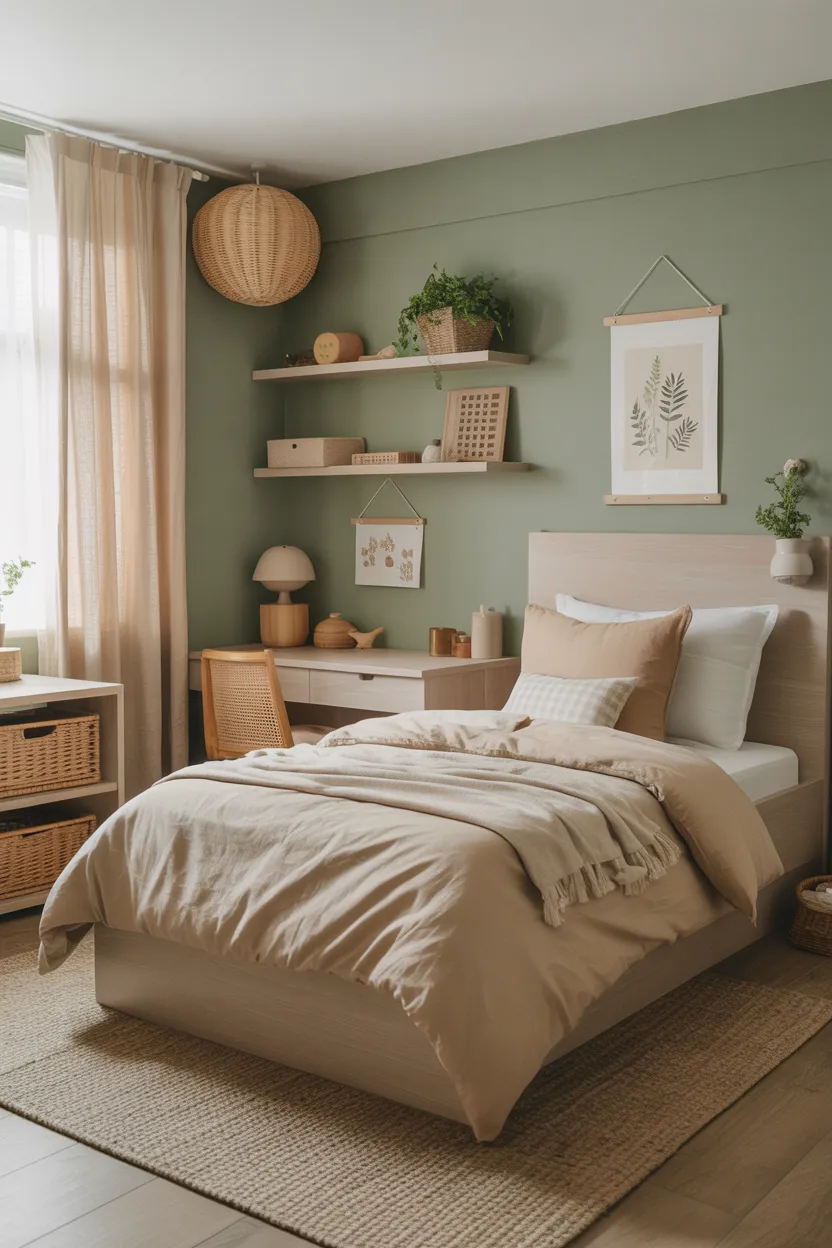
Sage green and warm beige create a bedroom that feels calm, fresh, and easy to live with. If you want a room that feels peaceful without looking boring, this combo deserves a serious look.
Sage green has a soft, earthy quality that brings a relaxed mood into the room. It feels natural and soothing, which makes it perfect for a bedroom. Warm beige adds softness and warmth, so the room feels comfortable instead of cold or flat. Together, they create a balanced look that feels thoughtful and inviting.
I love this palette for parents who want something a little different from the usual blue heavy options. It still feels kid friendly, but it does not scream for attention. It feels subtle in a good way. Ever walk into a room and instantly feel more relaxed? This combo does that.
This color scheme works beautifully with natural materials. Wood furniture, woven baskets, cotton bedding, and simple linen curtains all look great here. The room ends up feeling cozy and grounded without losing that fresh, airy look.
To make this palette feel even more functional, use sage on the walls and beige in the larger furniture or textiles. That keeps the room soft and visually balanced. You can add a little black in lamps or frames if you want some contrast.
This is also a smart pick for a room that needs to last beyond childhood. It feels stylish now and still works later, which is something I always appreciate in a design choice.
3. Charcoal Gray and Mustard Yellow
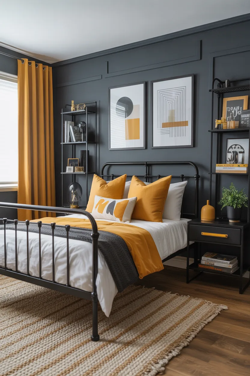
If you want a boy’s bedroom with a little edge and a lot of personality, charcoal gray and mustard yellow can look fantastic. This combo feels cool, modern, and energetic without going over the top.
Charcoal gray gives the room a strong base. It feels mature, practical, and easy to style. Mustard yellow adds warmth and fun, which keeps the room from looking too serious. That contrast creates a space that feels dynamic and interesting, but still controlled.
I’ve always liked charcoal in kids’ rooms more than people expect. It hides wear better than lighter colors, and it makes bright accents pop in a really nice way. Mustard works especially well because it feels cheerful without looking too loud or cartoonish. Bright primary yellow can sometimes feel a bit much. Mustard has more depth, so it feels smarter and more stylish.
Use charcoal on one wall or in larger pieces like bedding or a rug. Then bring mustard in through pillows, art, storage bins, or a reading chair. This keeps the color pop intentional instead of overwhelming.
This palette looks great with:
- Black metal furniture
- Warm wood tones
- Geometric patterns
- Simple industrial lighting
- White trim or bedding for contrast
It is a strong look, but it still feels livable. That matters, because a room should not just look cool for five minutes in a photo. It has to work every day too.
Also Rad:25 Decoration Mirror Ideas That Instantly Look Stylish
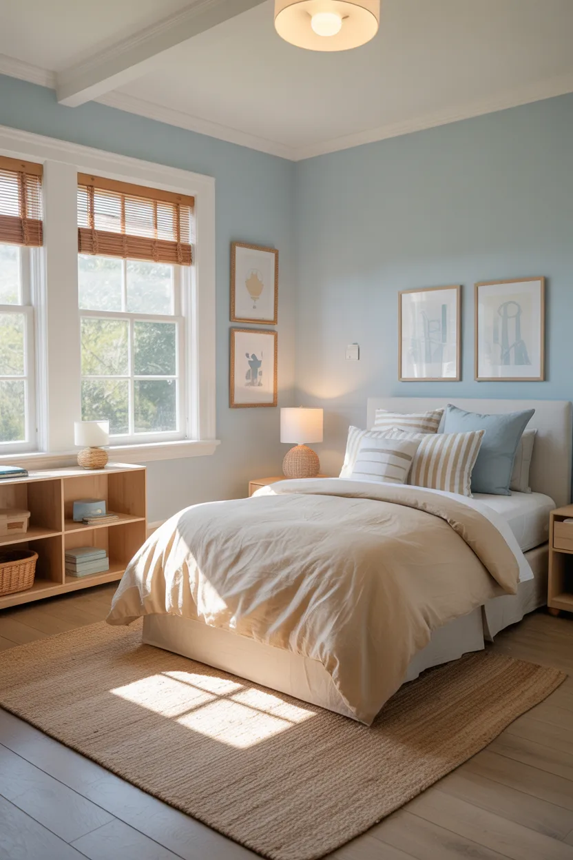
4. Sky Blue and Soft Gray
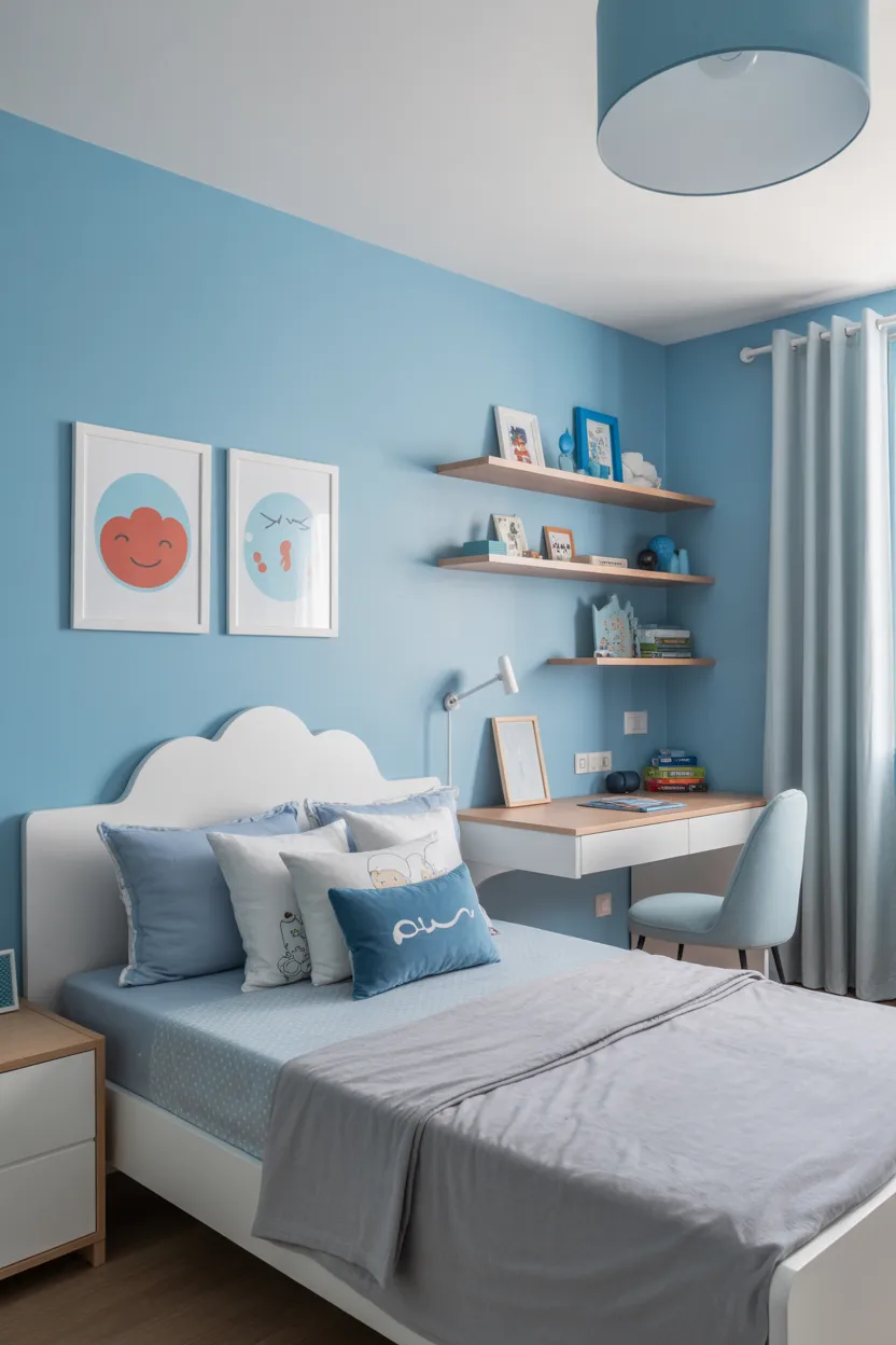
Sky blue and soft gray offer a lighter, gentler look that still feels fun and practical. This pairing works really well if you want the room to feel open, cheerful, and calm at the same time.
Sky blue instantly brings freshness into a room. It has that clean, airy effect that helps a bedroom feel larger and brighter. Soft gray keeps everything grounded and prevents the palette from feeling too sweet or too young. Together, they create a balanced look that works beautifully in both small and medium sized rooms.
I like this combination because it feels easy. It does not fight with furniture. It does not demand a ton of decoration. It just makes the room feel good. Honestly, that is more useful than some ultra trendy color scheme that looks amazing online and slightly confusing in real life.
This is a great choice for younger boys, especially if you want something playful without making the room feel overly themed. It also works nicely with clouds, stars, simple stripes, or modern toy storage.
To make the room feel even more polished, use soft gray in the bigger furniture pieces or bedding, and let sky blue shine on the walls or in accent decor. White trim and light flooring make this palette look even better.
If you want a room that feels restful at night and fresh during the day, this one checks both boxes easily.
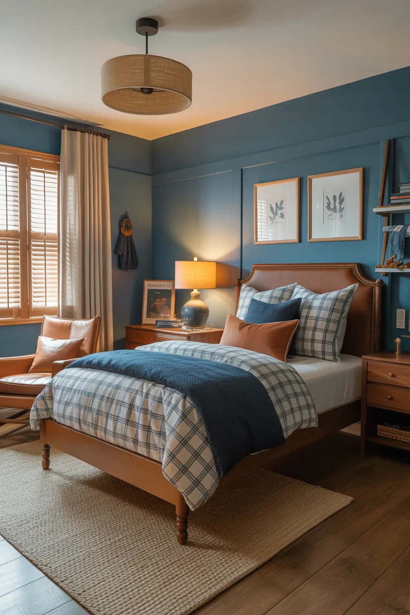
5. Forest Green and Tan
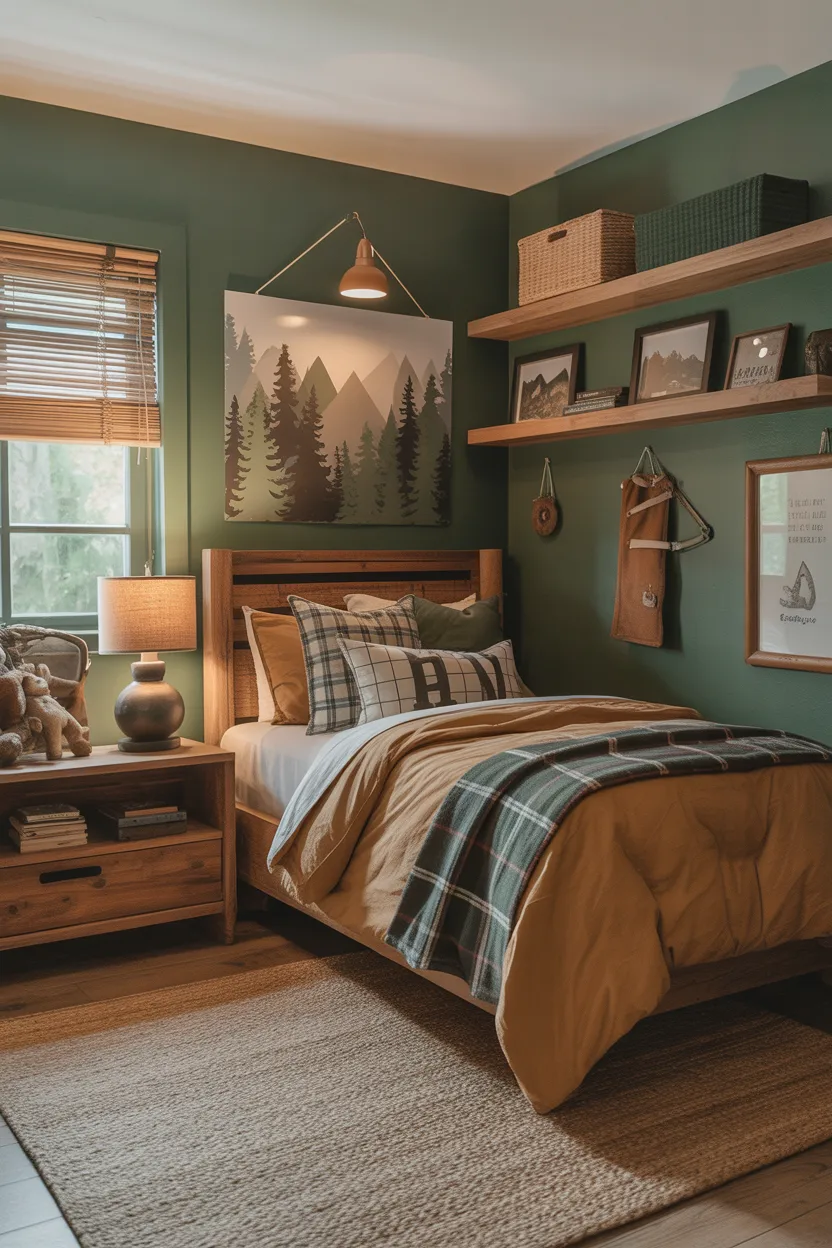
Forest green and tan create a room that feels rich, cozy, and a little adventurous. This color scheme has a warm, grounded vibe that works beautifully in a boy’s bedroom, especially if you want something with more depth than the typical pale blue or standard gray.
Forest green brings strength and character into the space. It feels earthy and substantial, which makes the room feel more designed and less generic. Tan softens the green and adds warmth, so the overall look stays inviting and comfortable.
I really like this combo for nature inspired rooms. It works especially well if your child likes camping, animals, maps, wood textures, or anything with an outdoorsy feel. It has personality, but it still feels timeless enough to last.
You do not need to go fully dark with this palette. Even one forest green wall can make a big difference. Then you can use tan in rugs, curtains, bedding, baskets, or upholstered pieces to warm up the space.
This palette pairs especially well with:
- Medium or dark wood furniture
- Leather details
- Plaid or striped fabrics
- Cream bedding
- Black or bronze hardware
The overall look feels strong and practical, but it also feels cozy. That mix makes a bedroom feel more personal and more comfortable.
Also Read: 22 Modern Office Desks with Drawers for a Clean Setup
6. Light Blue and Sandy Beige
Light blue and sandy beige create a bedroom that feels soft, bright, and relaxed. This combo has an easygoing look that feels cheerful without becoming loud, which makes it a smart option for a room that needs both energy and comfort.
Light blue brings freshness and a sense of openness. Sandy beige adds warmth and softness, so the room does not feel cold or too washed out. Together, these colors make the bedroom feel balanced and approachable.
I think this palette works especially well for rooms that get good natural light. The colors reflect light beautifully and help the whole space feel airy. It also has a slightly beachy feel without turning the room into a full nautical theme, which is nice if you want something subtle.
You can use light blue on the walls and bring beige in through the rug, curtains, or upholstered headboard. Or flip it if you want a warmer overall look. Both versions work well.
This combo looks great with:
- White furniture
- Natural wood accents
- Striped bedding
- Simple woven textures
- Soft gray accessories
It feels calm and pleasant, but it still has enough color to keep the room from looking bland. That is a solid design win.
7. Olive Green and Cream
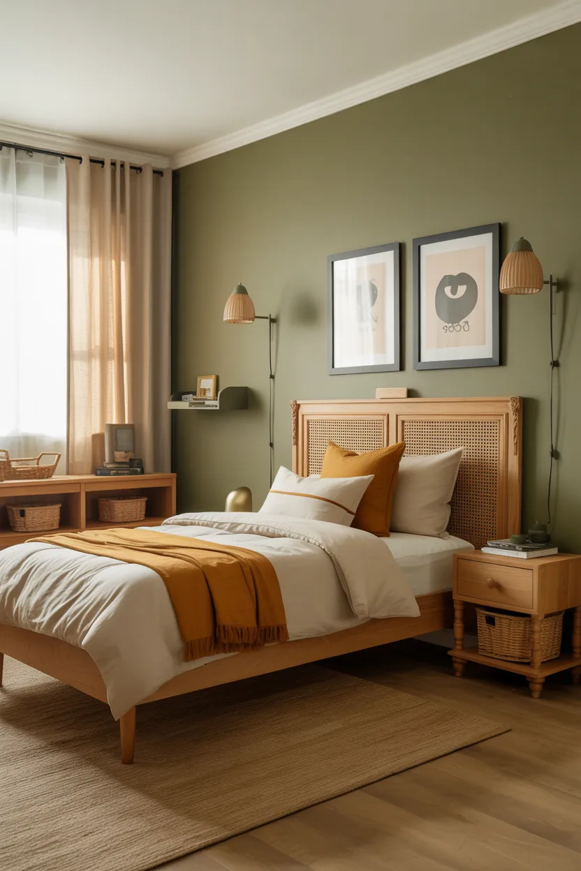
Olive green and cream feel warm, stylish, and a little more unique than the usual color combinations you see in boys’ bedrooms. If you want something that feels cool but still practical, this pairing has a lot going for it.
Olive green adds depth and personality. It feels earthy, grounded, and just mature enough to make the room feel a little more elevated. Cream keeps the palette soft and prevents the space from looking too dark. That balance is what makes this combo work so well.
I like olive because it stands out without shouting. It feels different, but not in a trendy-for-two-weeks kind of way. It also works surprisingly well with a lot of decor styles, including rustic, modern, simple, or even vintage inspired spaces.
Try olive on an accent wall behind the bed or on lower wall paneling if you want extra visual interest. Then use cream in bedding, curtains, lampshades, or larger storage pieces to lighten the look.
A few details that pair well with this scheme include:
- Natural oak furniture
- Black metal lamps
- Tan leather accents
- Simple framed prints
- Soft white bedding
This palette feels relaxed and a little more grown up, which makes it a great pick for a room that needs longevity.
Also Read: 21 Bedroom Shelving Ideas That Look Neat and Pretty
8. Teal and Light Gray
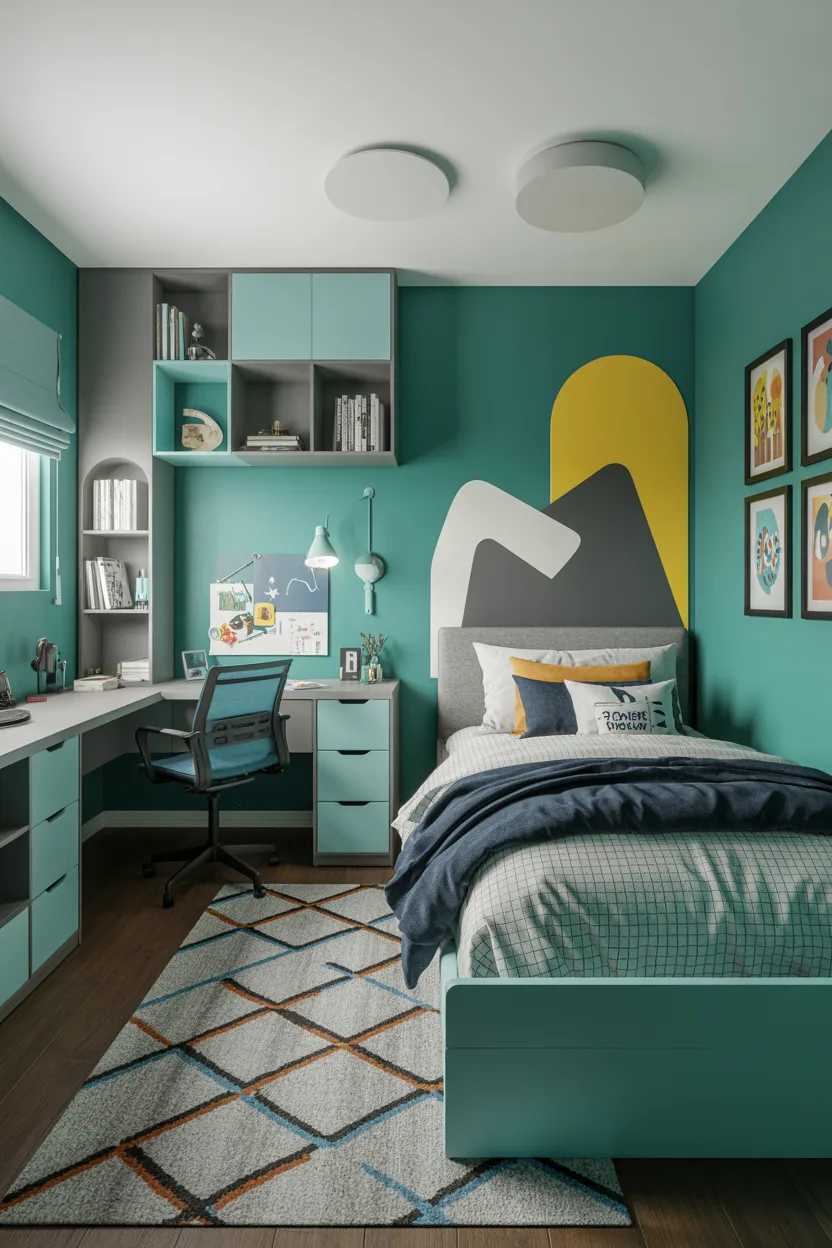
If you want the room to feel lively without turning into a rainbow explosion, teal and light gray can work beautifully. This combination feels energetic, modern, and really easy to style.
Teal brings a bold splash of personality into the room. It has more punch than soft blue, but it still feels polished and stylish. Light gray keeps that energy under control and gives the room a clean, balanced base.
I always think teal works best when you use it with intention. It looks amazing on one wall, in bold bedding, or in a statement chair. If you put it absolutely everywhere, it can start to feel like the room is trying a little too hard. One or two strong moments usually do the trick.
Gray helps the room feel functional because it hides a lot of everyday mess better than white. That may not sound glamorous, but practical color choices matter when you are decorating a real bedroom and not a showroom.
Use teal in a few key spots like:
- An accent wall
- Curtains
- A rug
- Storage bins
- Wall art
Then let light gray carry the bigger pieces or the remaining walls. The finished room feels fresh, playful, and organized all at once.
9. Black and White with Wood Tones
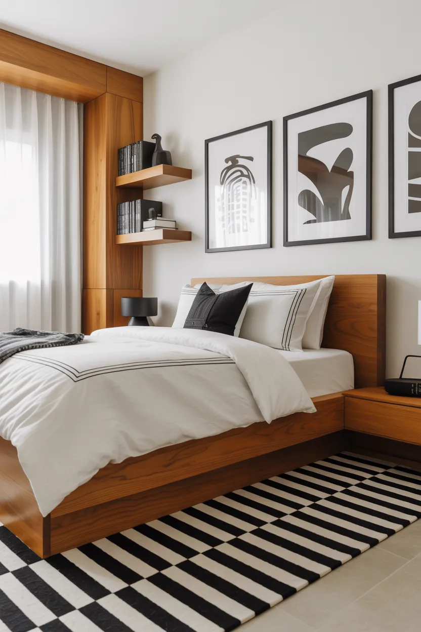
Black and white with wood tones create a boy’s bedroom that feels modern, sharp, and surprisingly warm. This color combination works really well if you want a room that feels clean and bold without losing comfort.
Black adds structure and contrast. White keeps the space open and bright. Wood tones soften the look and stop it from feeling too stark or cold. That combination gives you a room that feels stylish, but still livable and welcoming.
I love this palette for boys who prefer a more minimal or modern style. It works well with graphic prints, simple shelving, and streamlined furniture. It also gives you a neutral base that you can update later with any accent color you want.
The key here is balance. You want black to define the room, not swallow it whole. Think black bed frames, picture frames, a desk chair, or a light fixture. Let white handle the walls or bedding, and use wood in furniture or accessories to warm everything up.
This setup looks especially good with:
- Simple striped or checkered textiles
- Natural oak furniture
- Monochrome wall art
- A soft neutral rug
The end result feels crisp and cool, but still comfortable enough for everyday life.
Also Read: 24 Bathroom Ideas That Make Your Space Look Better
10. Rust Orange and Warm Gray
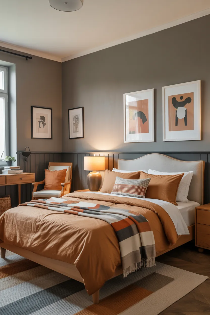
Rust orange and warm gray bring a cozy, slightly unexpected look to a boy’s bedroom. This color scheme feels rich, warm, and full of personality, but it still stays grounded enough for daily use.
Rust orange adds energy and warmth. It has that earthy depth that feels more interesting than bright orange, which can go a little too playful if you are not careful. Warm gray gives the room a practical base and keeps the overall look balanced.
I really like rust because it feels fun in a more relaxed way. It adds life to the room without making the walls feel like they are yelling at you. That is always appreciated. Warm gray pairs well with it because it tones everything down just enough.
This combo works especially well in bedrooms with wood furniture, dark metal accents, or simple sports and adventure inspired decor. You can make it feel rustic, modern, or casual depending on what you pair with it.
Use gray on the walls and bring rust in through bedding, artwork, an upholstered chair, or storage boxes. That way, the room feels colorful but still calm enough for sleep and homework.
It is a great choice if you want a room that feels a little different without becoming hard to style later.
11. Dusty Blue and White
Dusty blue and white create a bedroom that feels soft, polished, and very easy to live with. If you like blue but want something more muted and relaxed than a bright or bold shade, dusty blue works beautifully.
Dusty blue has a calm, subtle quality that makes a room feel peaceful right away. White adds brightness and contrast, so the space feels fresh and clean. Together, these colors create a bedroom that feels thoughtful and balanced.
I recommend this palette often because it works for so many ages. It feels sweet enough for younger boys but also refined enough to grow with them. That kind of flexibility makes decorating a lot easier.
This scheme also works well with almost any supporting accent. You can add tan, gray, black, navy, or even a muted green, and the room still feels cohesive. That gives you more freedom with decor, which is always helpful.
To make the room feel layered and inviting, combine dusty blue walls with white bedding and a few natural textures. A woven basket, linen curtains, or wood shelves make a big difference.
The overall effect feels calm, clean, and a little elevated without being fussy. That is a very good place for a bedroom to land.
Also Read: 22 Rustic Living Room Ideas for Small Spaces That Feel Cozy
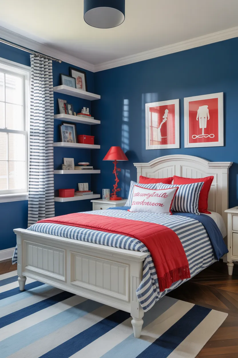
12. Red, Gray, and White
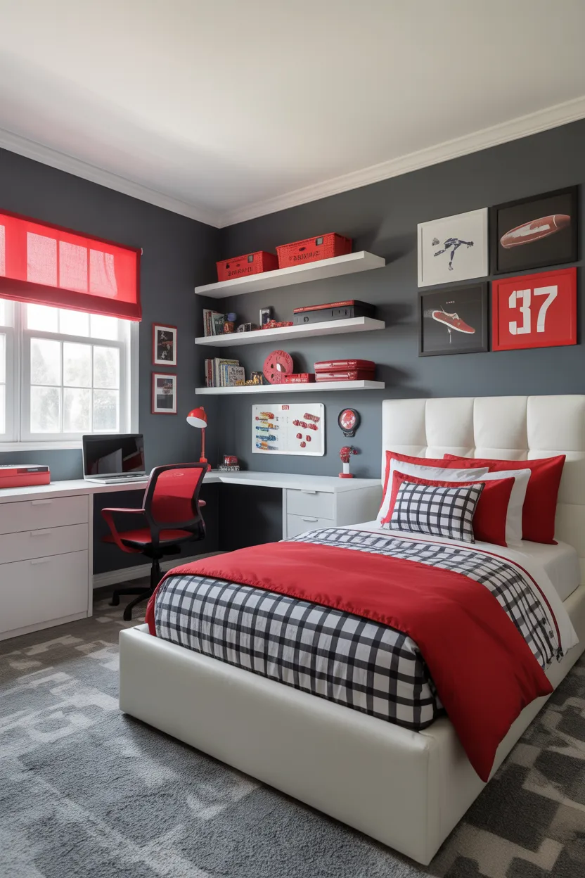
For a more energetic look, red, gray, and white can create a boy’s bedroom that feels bold, fun, and full of movement. This is a great option for kids who love sports, racing themes, or spaces that feel more active and exciting.
Red brings energy fast. It grabs attention and adds a lot of personality. Gray helps control that energy so the room does not feel chaotic. White keeps everything bright and gives the eye a place to rest.
I think this combo works best when you treat red like an accent, not the whole story. A full bright red room can get overwhelming very quickly. It is the decor equivalent of drinking three energy drinks and wondering why you feel stressed. Smaller doses work much better.
Use red in:
- Bedding
- Wall art
- Desk accessories
- A chair
- One accent wall
Let gray and white handle most of the room. That keeps the palette exciting, but still functional. The room feels lively without becoming exhausting.
This setup works especially well with simple modern furniture, bold graphic prints, and organized storage. It has a sporty, high energy look that a lot of boys really enjoy.
13. Denim Blue and Camel
Denim blue and camel create a boy’s bedroom that feels relaxed, warm, and effortlessly stylish. This combination has that casual, layered feel that makes a room look put together without looking overly decorated.
Denim blue feels familiar and comforting. It brings color into the room in a grounded, easygoing way. Camel adds warmth and richness, which keeps the room from looking too cool or flat. Together, they create a really balanced palette.
I like this combo because it feels versatile. It works in a modern room, a rustic room, or even a slightly vintage inspired space. You can make it feel cozy, classic, or a little rugged depending on the furniture and accessories you choose.
Use denim blue in bedding, walls, or curtains, and bring camel in through an upholstered chair, leather accents, baskets, or a warm toned rug. Wood furniture looks especially good with this palette.
This color scheme pairs beautifully with:
- Plaid blankets
- Dark or medium wood furniture
- Simple black lamps
- Cream bedding
- Navy or white accents
The final look feels easy, functional, and warm. It is one of those combinations that just works without creating drama.
Also Read: 24 Kitchen Backsplash Ideas That Instantly Look High End
14. Mint Green and White
Mint green and white create a bedroom that feels fresh, bright, and playful. If you want a room with a lighter, more cheerful look, this palette can be a great fit.
Mint green adds a clean pop of color without feeling too strong. It has a gentle, happy quality that works really well in smaller spaces because it helps the room feel open and airy. White keeps everything crisp and prevents the mint from feeling too sugary.
I know some people hear mint and immediately worry that it might feel too soft. But when you pair it with light wood, black accents, or simple modern decor, it looks really fresh and cool. It is all about how you style it.
This palette works especially well in rooms with lots of natural light. The space ends up feeling bright and breezy throughout the day, which helps the whole room feel more inviting.
To make the room feel a bit more grounded, add details like:
- Natural wood furniture
- Black framed art
- Simple gray bedding
- Geometric patterns
- Minimal shelves
Mint and white feel fun without becoming noisy, which makes them a smart choice for a bedroom that needs both personality and calm.
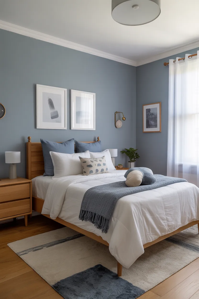
15. Slate Blue and Tan
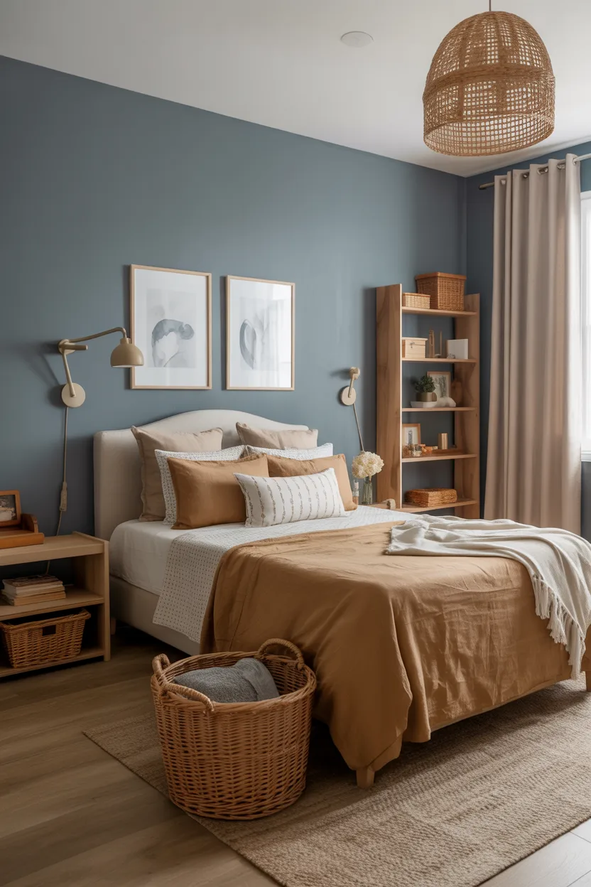
Slate blue and tan create a room that feels balanced, practical, and quietly stylish. This color scheme gives you enough personality to make the room interesting, but it still feels easy to live with long term.
Slate blue has a slightly more muted, mature feel than brighter blues. It adds color and depth without overwhelming the space. Tan brings warmth and softness, which makes the whole room feel comfortable and grounded.
I really like this palette for a boy’s room because it works across a wide age range. It feels polished enough for older kids but still approachable for younger ones. That makes it a great option if you want the room to last.
This combination works beautifully with layered textures. Tan rugs, woven baskets, linen curtains, and wooden furniture all pair nicely with slate blue. The room ends up feeling cozy and complete without needing tons of decor.
Try slate blue on the walls and tan in the supporting pieces. Or keep the walls neutral and use slate in bedding and storage. Either way, you get a room that feels smart and functional.
It is one of those palettes that does its job really well without shouting for attention, and honestly, that is a quality more rooms should have.
Also Read: 23 Kid Friendly Bedroom Color Ideas for Restful Nights
16. Aqua and White with Navy Accents
Aqua and white with navy accents create a bedroom that feels bright, fresh, and energetic in a really balanced way. This combination has a fun, lively vibe, but navy keeps it from drifting into overly playful territory.
Aqua adds a clean burst of color that instantly makes the room feel more cheerful. White keeps the room open and bright. Navy adds contrast and helps anchor the palette so it feels more intentional and organized.
I think this combo works really well for boys who want a room with some personality but still want it to feel neat and stylish. Aqua alone can feel a little too light if you do not pair it with something stronger. Navy solves that problem beautifully.
Use aqua in bedding, a feature wall, or curtains, and then bring in navy through lamps, frames, cushions, or a rug. That gives the room structure while keeping the overall mood light.
This palette works especially well with:
- White furniture
- Striped patterns
- Simple coastal touches
- Light wood finishes
- Minimal wall decor
It feels playful and fresh, but it still looks pulled together. That is exactly the kind of balance that makes a bedroom both fun and functional.
17. Brown and Blue
Brown and blue remain one of the most dependable color pairings for a boy’s bedroom. This combination feels classic, comfortable, and easy to build around. It has enough contrast to stay interesting, but it also feels familiar and cozy.
Blue brings freshness and calm into the room. Brown adds warmth, stability, and that grounded feeling that makes the room feel comfortable. Together, they create a space that feels inviting and practical.
I’ve always liked this combo because it works with almost any furniture style. Wood furniture fits naturally with brown, of course, but blue helps keep the room from looking too heavy. The result feels warm, balanced, and easy on the eyes.
You can use brown through wood furniture, leather details, baskets, or rugs. Then bring blue in through the walls, bedding, curtains, or artwork. Navy, dusty blue, or medium denim shades all work really well here.
To make the room feel even more polished, add:
- Cream or white bedding
- Simple plaid accents
- A striped rug
- Black metal lighting
- Floating wood shelves
This palette feels strong without being harsh and warm without feeling dull. That is a pretty ideal combo for a bedroom.
Also Read: 21 Bedroom Shelving Ideas That Look Neat and Pretty
18. Greige and Deep Blue
Greige and deep blue create a room that feels calm, smart, and very versatile. If you want a bedroom that looks polished but still approachable, this palette works beautifully.
Greige gives you the best of both worlds. It has the softness of beige and the clean feel of gray, which makes it incredibly easy to style. Deep blue adds richness and contrast without overpowering the room. Together, they create a balanced, grounded look.
I like this combination a lot for boys’ rooms because it does not feel childish, but it also does not feel too serious. It sits right in that sweet spot where the room feels practical, stylish, and comfortable.
This is also a great palette if you want to change decor over time. Greige acts like a quiet background color, while deep blue gives the room a strong anchor. You can swap art, rugs, or bedding later without fighting the base colors.
Try greige walls with deep blue bedding or a blue accent wall with neutral furniture. Add a few black or tan details to give the room more depth.
This palette feels modern and useful. It will not go out of style any time soon, which is always a nice bonus.
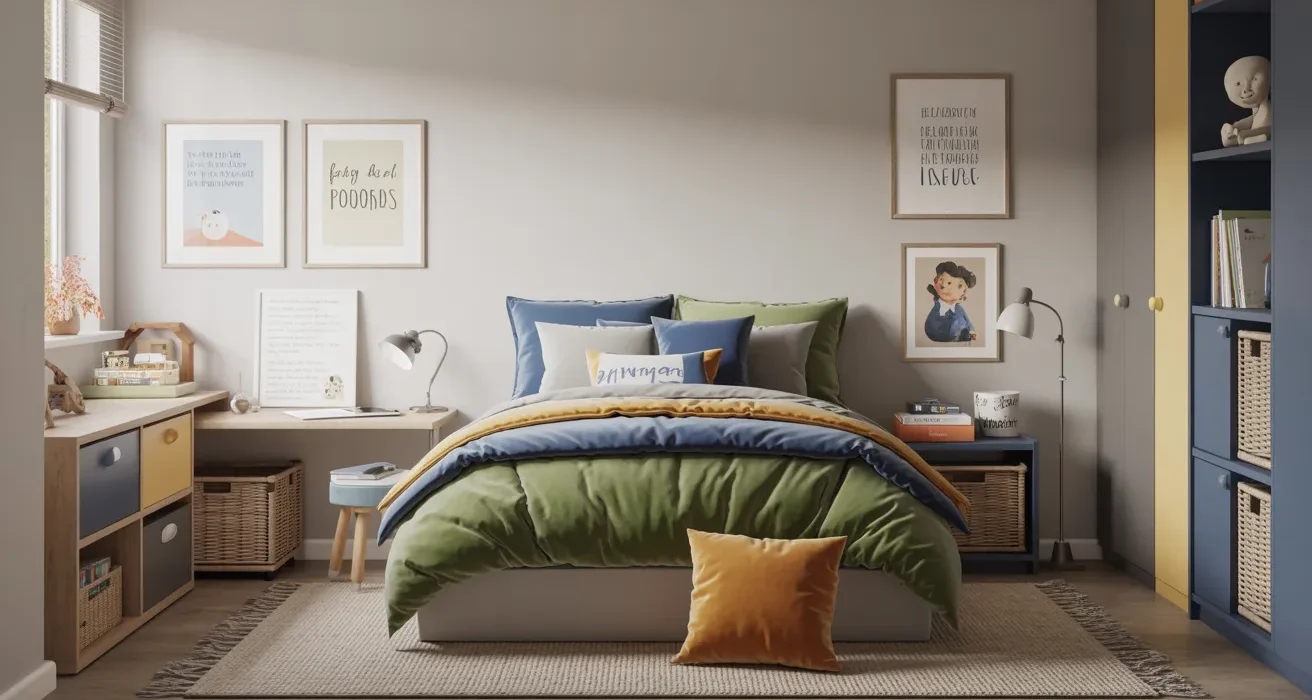
19. Yellow and Gray
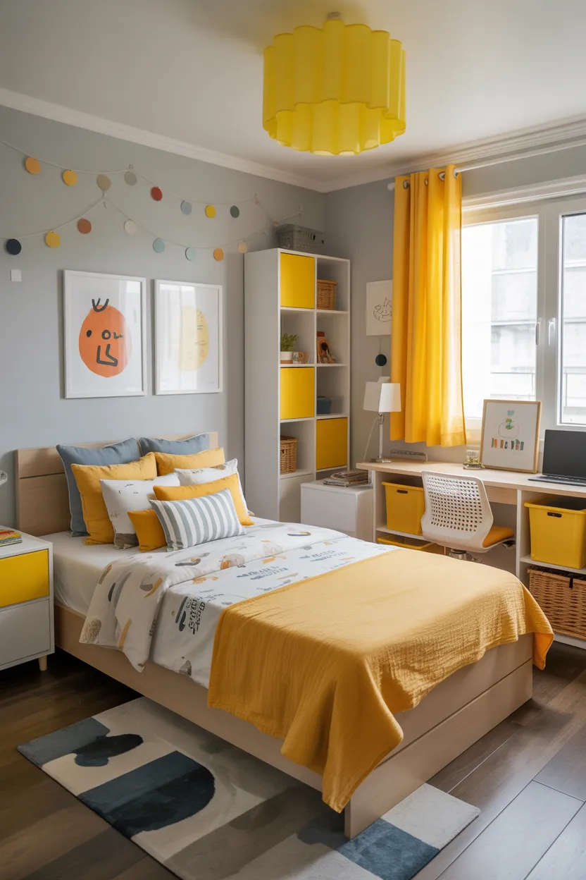
Yellow and gray create a bedroom that feels upbeat, bright, and balanced. This color pairing brings a lot of cheerful energy into the room, but gray keeps everything grounded so the space still feels calm enough for sleep and focus.
Yellow adds instant warmth and life. Gray gives the room structure and helps tone down the brightness. Together, these two colors create a room that feels fun and fresh without becoming too busy.
I think yellow works best when you choose a softer or slightly muted version rather than something neon and intense. Bright yellow can get overwhelming fast, especially on large surfaces. A warmer, more subdued yellow feels much easier to live with.
This palette works especially well in rooms that do not get a lot of sunlight. Yellow helps warm the space visually and makes the room feel more cheerful throughout the day. That little boost can make a surprising difference.
Use gray for the walls or larger furniture pieces, then bring yellow in through accents like:
- Throw pillows
- A blanket
- Wall art
- A desk chair
- Storage boxes
The finished room feels positive and energetic, but still functional. That is a very helpful mix in a child’s bedroom.
Also Read: 21 Pastel Pink and White Bedroom Decor Ideas That Feel Dreamy
20. Blue Gray and White
Blue gray and white create a bedroom that feels calm, clean, and timeless. If you want something understated but still full of style, this color combination works really well.
Blue gray has a soft, soothing quality that makes a room feel peaceful right away. White adds lightness and keeps the space feeling open and fresh. Together, they create a look that feels polished without trying too hard.
I recommend this palette often because it fits almost any style. It works with simple modern decor, sports accents, coastal touches, or traditional furniture. That flexibility makes the room much easier to update later.
This scheme also helps a room feel organized. Blue gray has enough depth to hide some everyday wear, but it still keeps the room looking light. That is useful in a real family home where bedrooms actually get used and not just admired for thirty seconds.
To make the room feel complete, layer in a few textures like:
- Soft knit blankets
- A low pile rug
- Wood shelves
- Minimal framed prints
- Simple white or natural curtains
The result feels restful, easy to style, and very practical. Those are all excellent things for a bedroom to be.
21. Hunter Green and Navy
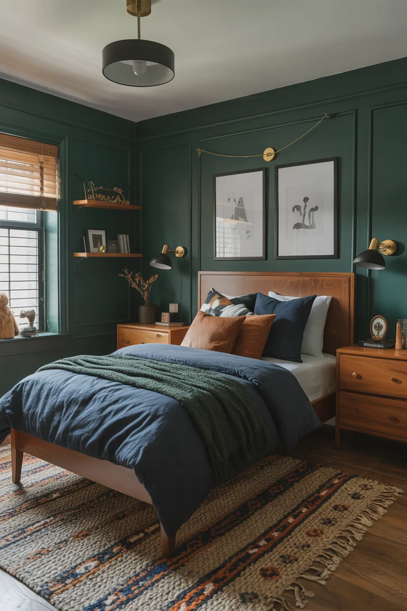
For a bolder, richer look, hunter green and navy create a boy’s bedroom with a lot of depth and personality. This combo feels adventurous, moody, and slightly elevated, while still staying functional when you use it carefully.
Hunter green brings an earthy richness into the room. Navy adds depth and structure. Since both colors are strong, the key is balance. You want them to work together, not compete for attention like two dramatic actors in the same scene.
I like this pairing best in rooms with decent natural light or larger layouts, because darker shades can make a small room feel more closed in if you use too much of them. That said, one hunter green wall with navy accents can look amazing even in a smaller space.
Use lighter supporting elements like white bedding, light wood furniture, or cream curtains to break up the darkness. That contrast helps the room feel more inviting and less heavy.
This palette looks especially good with:
- Brass or black lighting
- Wood furniture
- Simple adventure themed decor
- Minimal artwork
- Plaid or textured fabrics
It is a great choice for boys who want something a little cooler and less typical than the usual basic bedroom colors.
22. Beige and Blue with Black Accents
Beige and blue with black accents create one of the easiest and most balanced boy bedroom color schemes. This combination feels warm, fresh, and organized, which makes it a great fit for a room that needs both style and function.
Beige adds softness and warmth. Blue brings in personality and color. Black accents sharpen the room and give it structure. Together, these tones create a space that feels layered and intentional without looking overdone.
I really like black in small amounts here because it helps define the room. A black lamp, picture frame, bed frame, or desk chair can make a big visual difference without making the room feel too dark.
This setup also works really well if you want a space that can evolve. Beige keeps the room grounded, blue keeps it youthful, and black makes it feel more polished. That mix gives you a lot of flexibility as the room changes over time.
A few ways to use this palette include:
- Beige walls with blue bedding
- Blue walls with beige textiles
- Black hardware on furniture
- Black frames or lighting
- Natural wood for added warmth
This color scheme feels neat and functional, but it still has enough personality to keep the room from feeling generic.
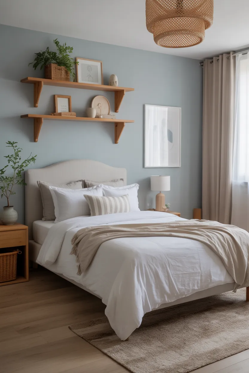
23. Soft Green and Blue
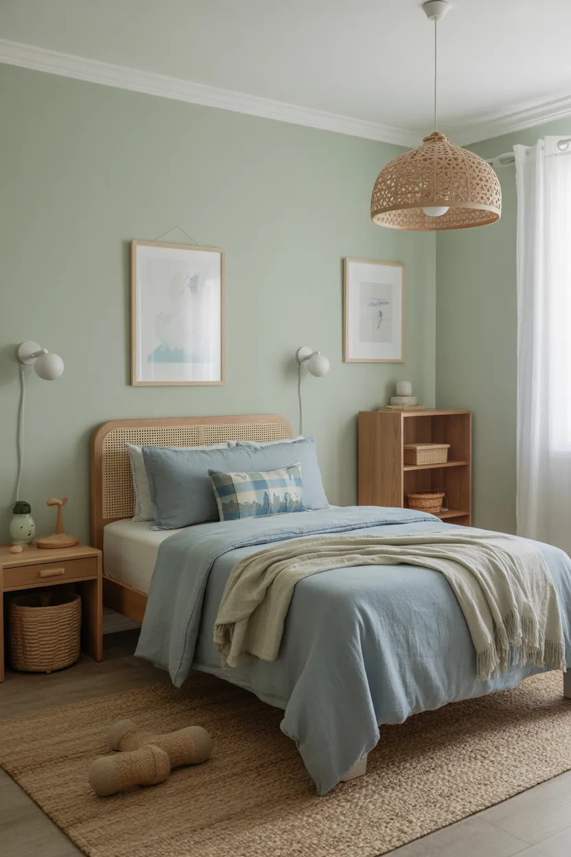
If you love both green and blue and do not want to choose, soft green and blue can work beautifully together. This combination feels calm, fresh, and quietly playful, which makes it a great option for a boy’s bedroom.
Soft green brings a natural, relaxed feeling to the room. Blue adds that familiar sense of calm and structure. Together, the two create a palette that feels gentle but not dull.
I’ve always liked this pairing because it feels effortless when you get the tones right. The trick is to keep both shades soft or slightly muted so they blend well together. If both colors are very bright, the room can start to feel too busy. Softer shades keep the look calm and cohesive.
This palette works especially well with white trim, wood furniture, and simple patterns. It feels comfortable right away, which is exactly what a bedroom should do.
Try using one color on the walls and the other in bedding, curtains, or artwork. You can also add small neutral details like beige or white to keep everything light and balanced.
The final result feels personal, peaceful, and very easy to spend time in. That kind of room never goes out of style.
24. Terracotta and Cream
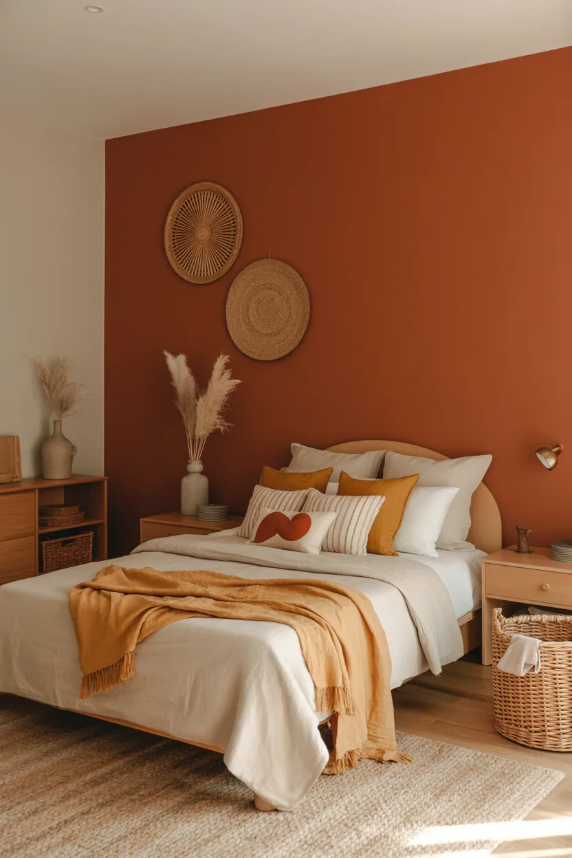
Terracotta and cream bring warmth, character, and a slightly creative feel to a boy’s bedroom. If you want something more original than blue and gray but still easy to live with, this palette can be a great choice.
Terracotta adds richness and warmth. It feels earthy, grounded, and full of personality. Cream softens that warmth and keeps the room feeling light enough for a bedroom. Together, they create a space that feels cozy and welcoming.
I really like terracotta because it stands out without feeling flashy. It has a natural warmth that makes a room feel comfortable, and it pairs beautifully with wood, olive, tan, and black. That gives you a lot of room to personalize the space.
This palette works especially well in bedrooms with natural textures. Wood furniture, woven storage, linen curtains, and simple cotton bedding all look great here. The room ends up feeling layered and intentional without looking overstyled.
Use terracotta in a painted accent wall, bedding, or a rug, and let cream handle the larger surfaces. That gives the room warmth without making it feel too dark.
It is a smart choice if you want a bedroom that feels fun in a more subtle, thoughtful way.
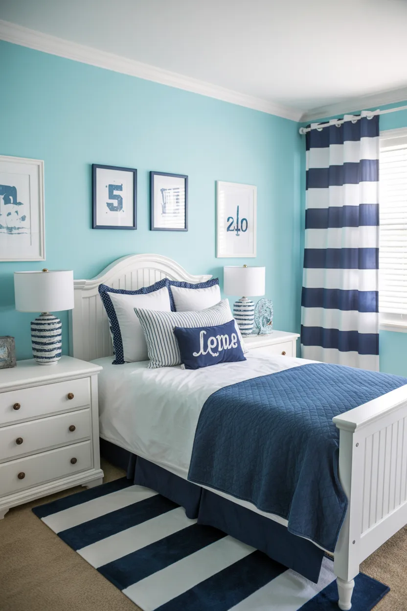
25. Classic Blue and White with Red Accents
Classic blue and white with red accents remain a favorite for a reason. This combination feels energetic, familiar, and easy to style. It works especially well if you want a room that feels playful and timeless at the same time.
Blue and white create a clean, fresh base. Red adds the excitement. When you use red in smaller amounts, it gives the room just enough punch without making the whole space feel too loud.
I think this palette works so well because it feels naturally kid friendly, but it also stays organized and crisp. It can lean sporty, nautical, travel inspired, or just generally classic depending on how you decorate it.
The best way to use this combo is to let blue and white dominate, then bring red in through a few strong accents. Think pillows, art, a throw blanket, or a chair. That gives you the fun without overwhelming the room.
This scheme looks especially good with:
- Striped bedding
- White furniture
- Navy storage pieces
- Simple wall hooks
- Red framed artwork or accessories
It is cheerful, functional, and easy to refresh later. That makes it a very practical choice for a boy’s bedroom.
How to Choose the Right Boy Bedroom Color Scheme
With so many good options, choosing the right one can feel a little overwhelming. But it gets much easier when you focus on function first and style second. The prettiest palette in the world will still annoy you if it does not suit the room or the child who uses it.
Start by thinking about the mood you want. Do you want the room to feel calm and restful? Bright and cheerful? Cozy and grounded? A room meant for sleep, reading, and downtime usually benefits from softer or more balanced tones. A room that doubles as a play space can handle a bit more energy.
Then think about the size and lighting of the room. Lighter colors usually help small rooms feel bigger. Darker shades can add depth and style, but they work best when the room gets enough light or when you use them in moderation.
I also think it helps to consider how fast your child’s tastes change. A super themed room might feel exciting now, but a more flexible color palette will usually last longer. That means fewer expensive updates later, which no one hates.
Here are a few practical tips:
- Choose one main color
- Add one neutral to balance it
- Use one accent color for personality
- Test paint in natural and artificial light
- Think about how the palette will age over time
That simple approach keeps the room cohesive and easier to decorate.
Simple Ways to Make the Color Scheme More Functional
A good color palette should do more than look nice. It should also make the room easier to use every day. That is where a little strategy helps a lot.
One of my favorite tricks is to use darker or stronger colors where the room gets more activity. For example, a darker accent wall behind a desk or bed can add depth and hide wear better than a super pale shade. Lighter colors work well on ceilings, trims, and areas where you want the room to feel open and airy.
You can also use color to subtly separate zones in the room. A calmer palette near the bed makes the sleep area feel more restful. Slightly brighter accents near the play area or desk can make those parts of the room feel more active and useful. It is a simple trick, but it really works.
Storage matters too. Matching bins, baskets, and shelves to the room’s color palette helps everything feel more organized, even when the room is not exactly perfect. Let’s be honest, no kid’s room stays magazine clean for long. Color can help fake a little order, and I fully support that.
Here are a few easy ways to make color work harder in the room:
- Use washable paint finishes on high traffic walls
- Choose darker textiles for everyday use
- Match storage pieces to the color palette
- Add contrast to make furniture stand out clearly
- Keep bold colors in smaller, flexible accessories
That way, the room looks better and functions better at the same time.
Final Thoughts
The best boy bedroom color ideas feel fun, practical, and personal all at once. That is what makes them work. You do not need the loudest paint color or the trendiest setup to create a room that looks great and feels right. You just need a palette that matches the mood, supports daily life, and gives the room some real personality.
Whether you love the clean contrast of navy and white, the calm softness of sage and beige, the bold energy of red and gray, or the cozy warmth of terracotta and cream, there is a color scheme here that can make the room feel more finished and more functional.
I always think the best bedrooms feel like they belong to the person using them. They feel comfortable, lived in, and easy to enjoy. So pick colors that make sense for the space, fit your child’s style, and still feel good when the toys, books, and laundry inevitably show up. Because they will. They always do.
If the room feels inviting, useful, and full of personality, you got it right. That is the goal, and thankfully, it does not require a design degree or a miracle.